TC brand redesign
DATE
15.09.2023
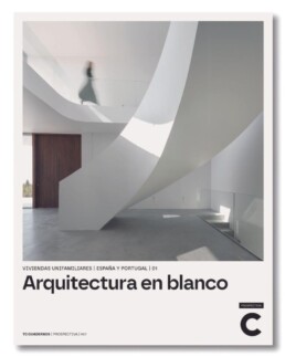
The designer David Cercós, linked for years to the publishing house General Ediciones de Arquitectura, has been in charge of the redesign of the brand of two of its most important series: TC Cuadernos and TC Prospectiva
In both cases he has played with a typographical alteration of the logo in which the thickness of the TC letters has increased, but distinguishing each collection from the point of view of its reading or interpretation. Thus, in the case of TC Cuadernos, the weight increases but maintains the position of the letters, while in the case of TC Prospectiva, it generates a fusion of both, leaving the horizontal part of the T and, below it, fitting the c.
MArch Valencia. Arquitectura y Diseño
© 2025 MArch Valencia. Arquitectura y Diseño
Privacy policy | Cookies policy | Terms of use


